Ever been curious about the story behind my name and logo? Today I am linking up with Art with Jenny K. to share my story!
First of all, I'll explain how my name, "Teachers Resource Force" came about. When I first opened my TpT Store, I wanted to keep it quite flexible and not limit it to subject or grades; I wanted to create a variety of different teaching resources.
I was happy with the "Teachers Resource" bit so I searched for something to rhyme with "resource" that sounded catchy. Once I found "force", I was immediately drawn to as it sounded kind of superhero like to me! Think:
"Teachers Resource Force to the Rescue" and
"May the Resource Force be With You"!
Once I had the name, I was ready to work on a logo. Unfortunately, that didn't come as easily and I went through a couple of other very bad designs first...:
I find it hilarious how these are so different and there's no obvious progression between them, is there?! I wasn't sure exactly what I wanted then, but I knew I liked the purple and black theme.
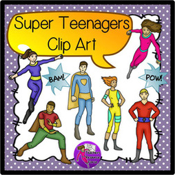
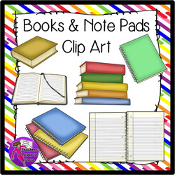
My final design developed once I started making teen clip art in my store. I decided to make my logo reflect the secondary market I teach by using some of my own clip art. I selected images from the following sets:
My final design developed once I started making teen clip art in my store. I decided to make my logo reflect the secondary market I teach by using some of my own clip art. I selected images from the following sets:
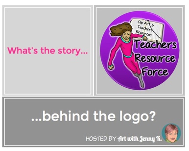
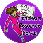
As I said earlier, I thought 'Teachers Resource Force' sounded quite superhero like, and so it was the teen superhero clip art above that kicked off the new logo as we know it. I liked both the brunette girls as they look the most like me - I ended up going with the pink one as she fit in a circle the best and I really liked the pink and purple together. [NB I have since removed the pink girl from that set and lowered the price, for branding reasons!].
The addition of the notebook came soon after, as I wanted to indicate that I create both clip art and teaching resources somewhere on the logo. The open book fit in perfectly, and with the text on top I think everything eventually tied in together well.
Finally, I put a white glow around all the images and text to make everything pop.











 RSS Feed


